Design Decisions

The impact of design

Design decisions that shape how users read, understand and act.

AI that fades away

Escape · Automatic API documentation

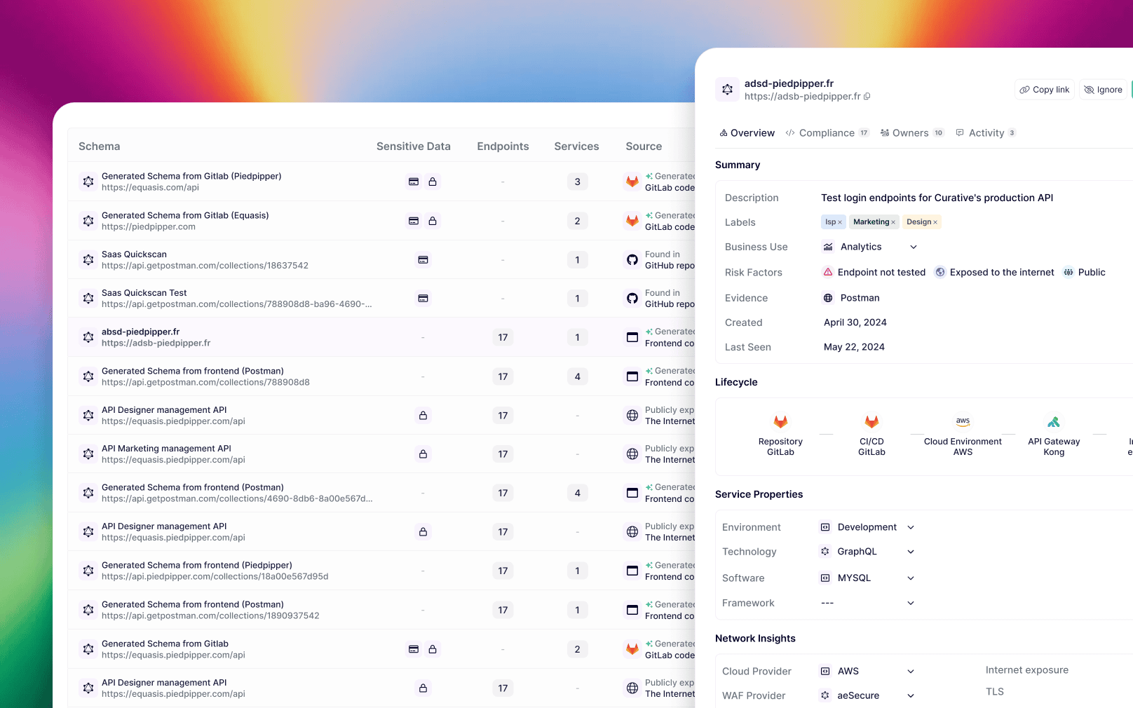
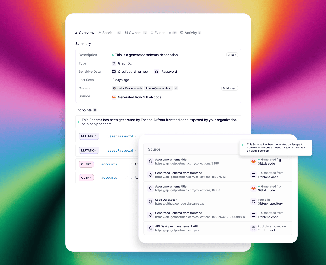
AI automatically generates schema descriptions and detects exposed endpoints from the source code, with no user action needed. The gain is immediate, the friction is zero.

But it never imposes itself: every generated element is clearly flagged, editable, traceable back to its source. The user stays in control of what they choose to keep.

The most effective AI is the one you don't notice. Until the moment you realize it just saved you an hour.
AI in product design

Prioritizing information

Escape / Backranks · Network investigation interfaces

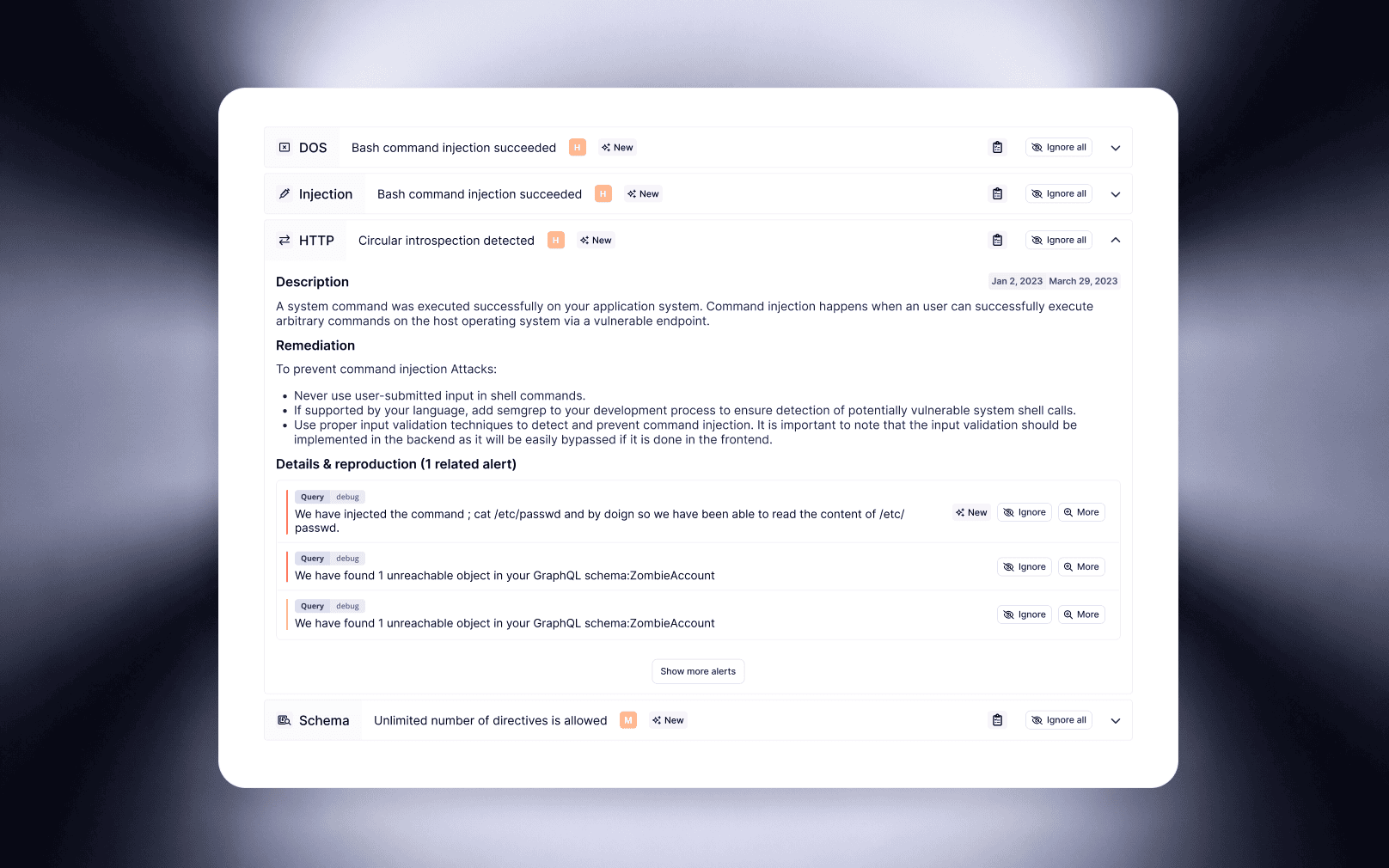
Prioritize information based on reading intent: the vulnerability's name and severity are visible at a glance, with no interaction. The developer instantly knows what's critical.

The alert's detail reveals itself on click, at the exact moment the developer is ready to understand and act.

On an investigation tool, every second of friction has a real cost. Surfacing the info sooner speeds up the decision.

Group info by category for simplicity

Data-heavy dashboard

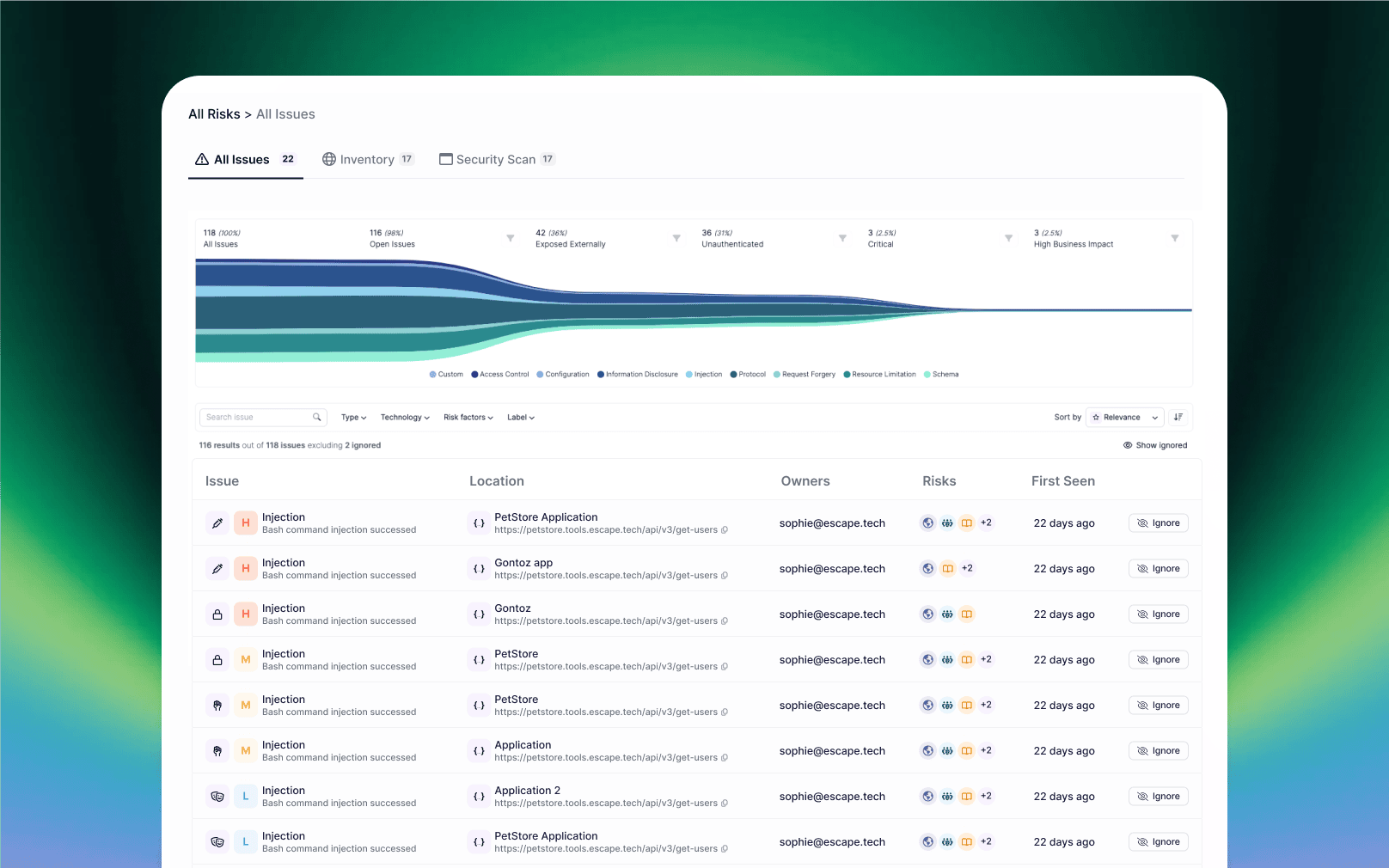
Escape · "All Issues" view

A global chart gives the shape of the problem first (volume, categories, severity) before the user even reads a row of the table. They grasp the overall state at a glance.

The table below stays readable despite the density: visual hierarchy, severity badges, aggregated indicators. Lots of data, zero cognitive overload.

Fewer visible items, more clarity, and a better chance the user acts on what actually matters.

Dashboard Data-Heavy

The Rule Builder

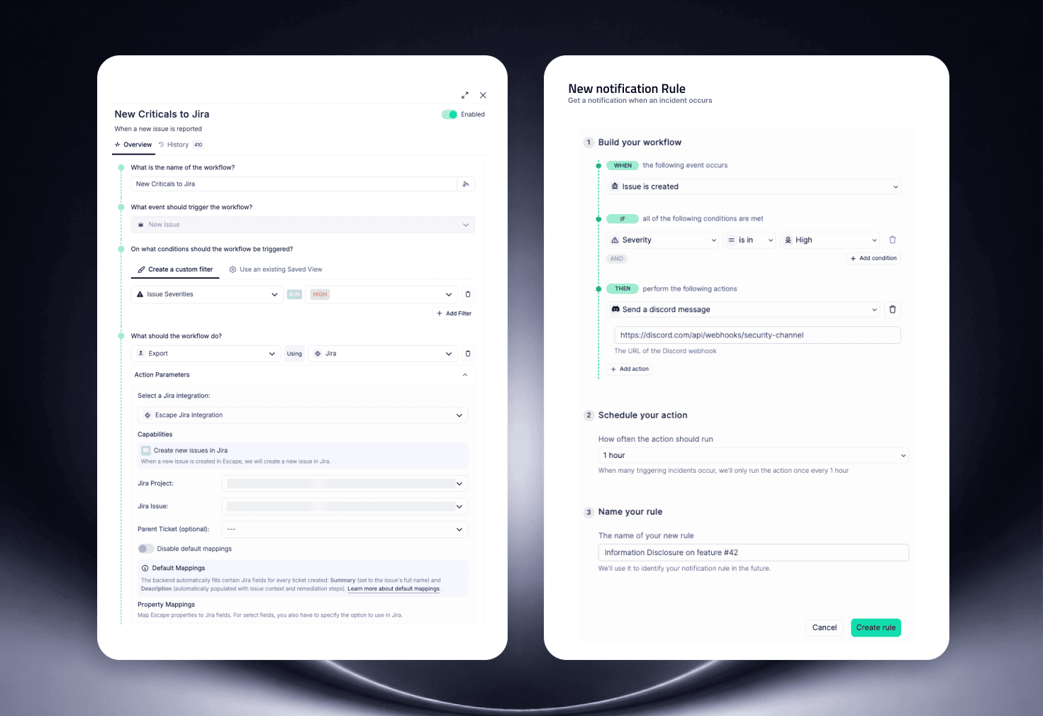
Escape (custom rules) · Aiotrust (business alarm rules)

Build a complex rule in a few guided clicks. Every step is structured: the user configures without ever writing a line of code.

The rule is named, saved, reusable. It becomes an asset that belongs to the team, not a configuration lost at the next session.

A user who creates a rule sees it as theirs. It's an invitation to invest in the product.

Rule Builder Design

Asking for input

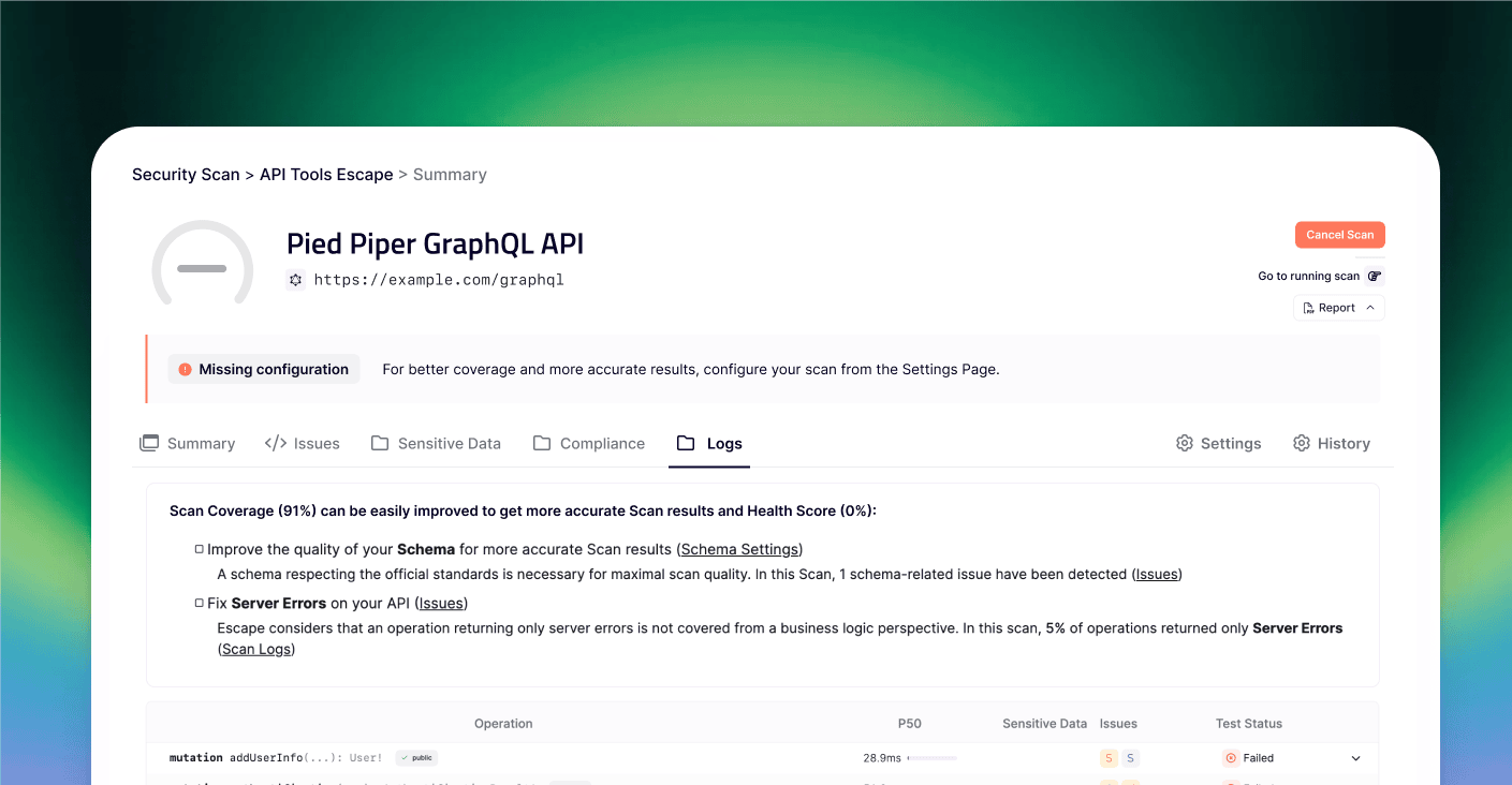
Escape · Onboarding and scan configuration

The product needs extra parameters to improve scan accuracy.

Instead of a complex onboarding before reaching any value, the user is let loose in the product with a basic configuration. They see the limits of that configuration for themselves the moment they see the scan results.

The right moment to ask the user for more effort is when they can concretely see what's in it for them.

Ask input to user onboarding

Contextualizing the metric

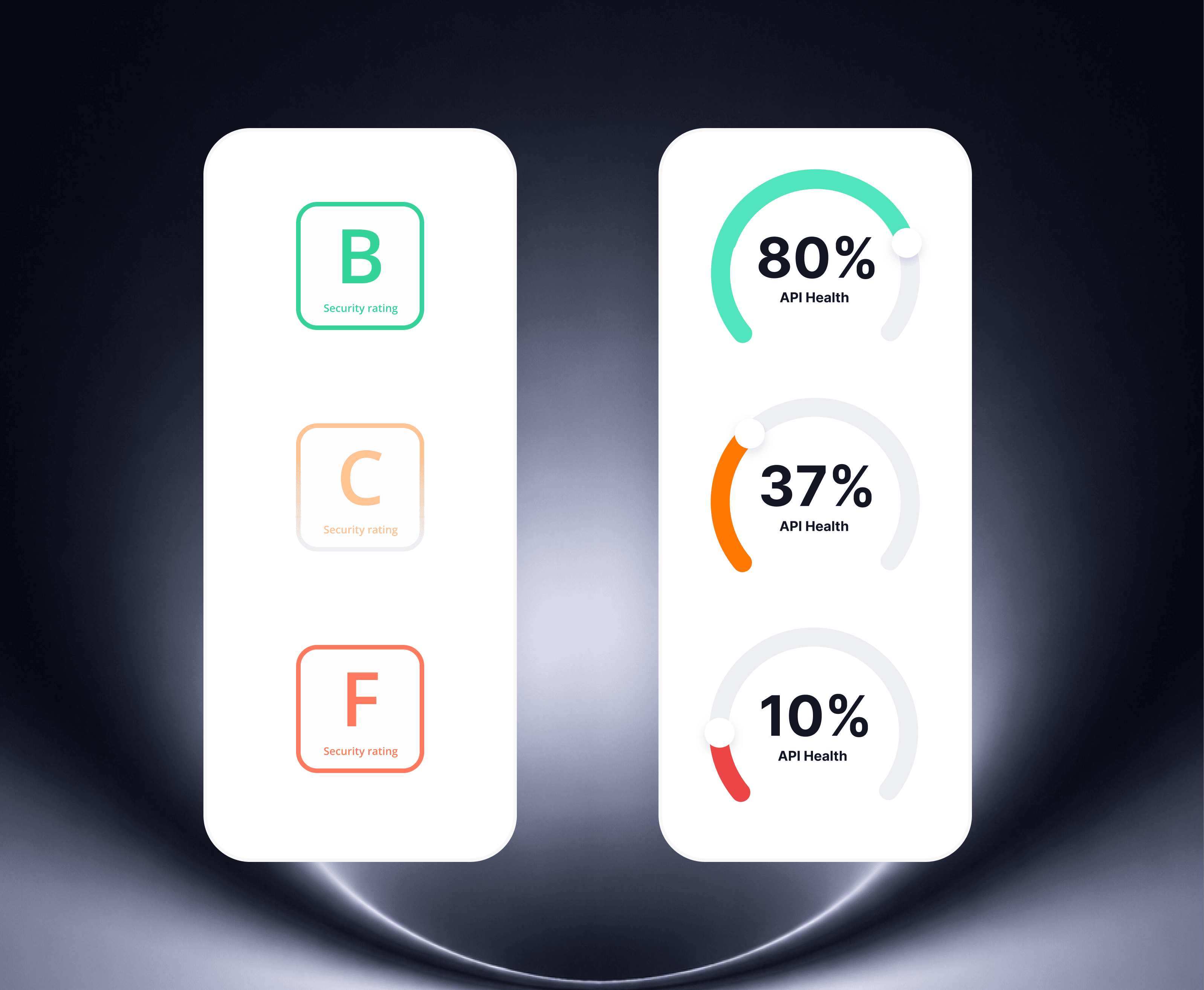
Escape · B2B cybersecurity

A letter grade is readable but has no anchor. The user doesn't know whether a "C" is bad or acceptable in their industry, nor how far they are from the next level.

Replacing the letter with a percentage and a progress bar changes the reading: the user sees where they stand, measures the gap, and positions themselves against their peers rather than an abstract scale. At a glance, they understand that 72% is decent, but there's room to grow.

The metric doesn't change. What changes is what it triggers emotionally.

API Health Score

Reducing cognitive load

Escape · Backranks

When an interface holds a lot of information, showing all of it at all times creates noise. The user doesn't know where to look.

Define a clear hierarchy: what's always visible, and what's reachable via a click into a side panel. This lets the user go deeper when they need to.

Information hierarchy is a stance on what matters. And that depends on what users actually need.

Reducing cognitive load

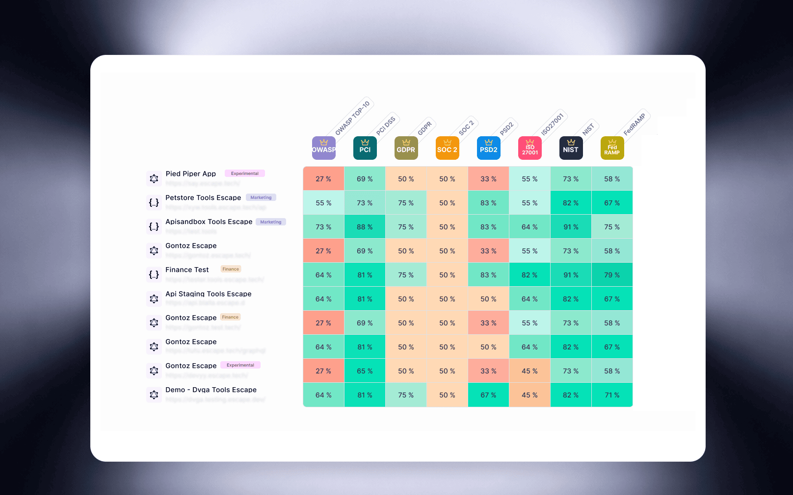
Multi-compliance, multi-application

Escape · Multi-application compliance view

Eight standards, ten applications, dozens of scores to cross-reference. Color does the reading work before the eye even reaches a number.

Red zones jump out instantly. The percentage stays there for anyone who needs precision, but it's no longer the only carrier of information.

When data is dense, color does the reading work that text can't do alone.

Compliance Matrix Design Feature

These decisions have one thing in common: small to the eye, big in use. B2B design isn't seen — it's felt in the fluidity with which a professional moves through their tool.

You have a project

Let's talk about what you
want to build.

A SaaS product, a redesign, an MVP?
I'll help you move fast without compromising on quality.

Discuss your project

✓ No commitment · Free · Reply within 24h